

Aug 13, 2026
I am delighted to be joined by Tom Harris from Climate Uncovered Substack for this article. Tom is a climate advocate who is interested in letting the data do the talking and bringing complex scientific research papers to a wider audience. I highly recommend his Substack and hope you subscribe for more of his highly insightful and relevant content.
Physics sets the shock. Policy sets how many people go hungry. Slowly though food insecurity, chronically through lack of calories, and acutely through the starvation that kills. Every number and figure we cover below carries a source, and a confidence level wherever the source states one, because the impacts on global and domestic hunger in a 2°C world due to climate change does not need to be exaggerated, the truth is scary enough.
The 2ºC Dinner Table is Already Being Set
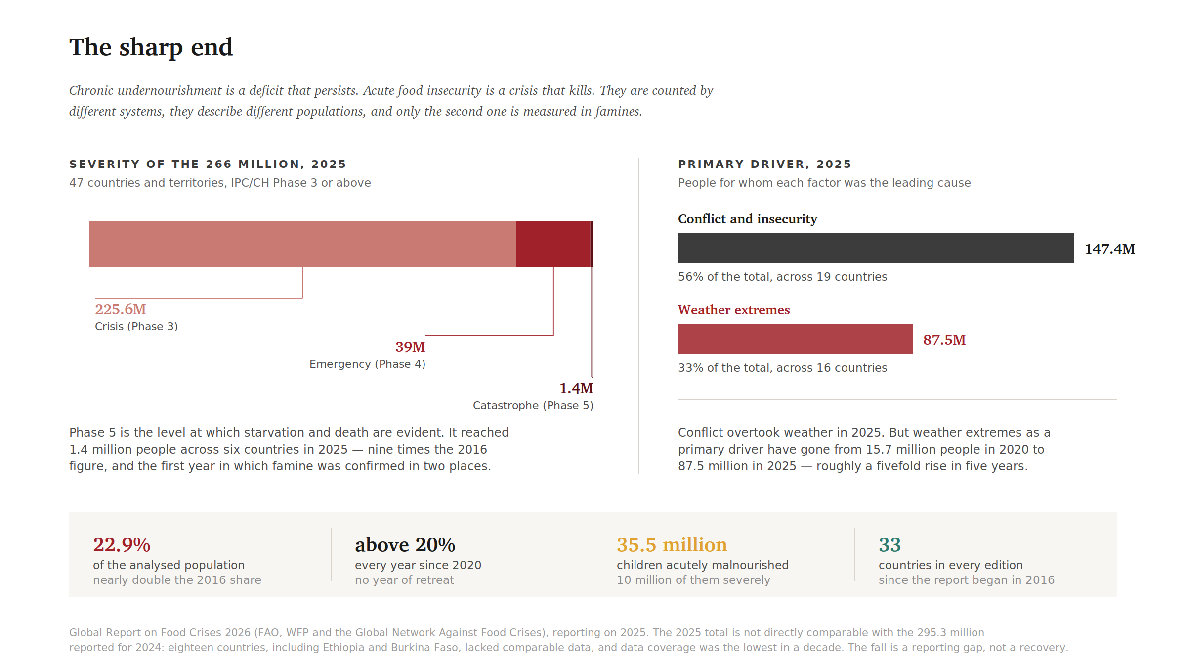
In 2025, for the first time in the history of the world’s hunger monitor, famine was confirmed in two countries in the same year. Parts of Gaza. Parts of Sudan, with four more countries on the brink of famine. Across six countries, 1.4 million people ended 2025 in the category the international humanitarian classification calls Catastrophe, the level at which starvation and death are no longer projected but counted body by body. That figure is nine times higher than it was a decade ago.
All of that happened at about 1.4°C of warming, in a world that still had a functioning humanitarian system.
Those figures measure acute hunger, the crisis level tracked by the Integrated Food Security Phase Classification, when a shock strips households of the last buffers between survival and starvation and famines are declared. This is different from chronic hunger, the persistent shortage of calories and nutrients that the UN Food and Agriculture Organization (FAO) estimates affect roughly 645 million people worldwide. It is also different from food insecurity, the broadest category, which captures people who have had to skip meals or go without food for a day or two. Because separate systems measure these three categories, they can move in different directions: chronic hunger can decline in the same year acute hunger rises. This article tracks all three and does not let the more reassuring number obscure the more dangerous one.
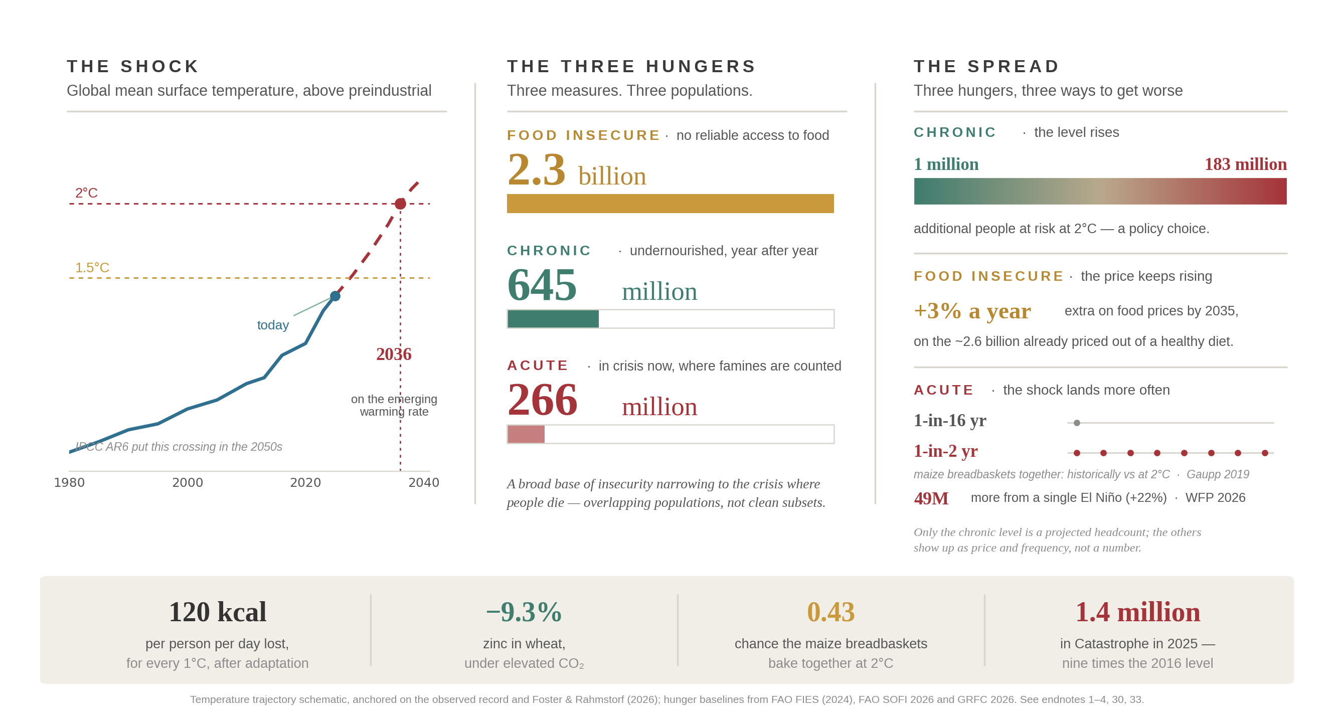
Figure 1. Global hunger at 2°C
The threshold this article discusses is what happens to hunger when the world crosses to 2°C above the historic (1850-1900) baseline, and the fact that this is no longer a problem of the 2050s. With the rate of warming now measured rather than modelled, 2°C could arrive as early as 2036. That is inside the working career of every official who will decide how to prepare for it, inside the term of most mortgages held by the people reading this, and before the high school graduation of a child about to start their education this autumn.
So, the question is not whether a hotter world makes more people hungry. That was answered in Somalia in 2022, where a drought that human warming made roughly a hundred times more likely killed an estimated 43,000 people, about half of them children under five. The question now is how many more, where, and whether anybody with the power to change the answer has the courage and the empathy to do something about it in the short time that remains.
The published answers are neither reassuring nor agreed. Estimates of how many additional people will go chronically hungry in a 2ºC world run from roughly one million to roughly 183 million.12 That is not a scientific inaccuracy or a rounding disagreement. It is a spread of nearly two orders of magnitude, due to the single most important fact in this article. The choice of how many people will go hungry depends on the policy choices our leaders make right now.
A range that wide usually means the underlying science is immature. Here it means something else, and that difference matters more than any single number in this article. The models producing the low end and the high end broadly agree on the physics. They agree on how much heat a maize plant can tolerate during pollination, where rainfall belts are shifting, and what a hotter atmosphere does to evaporative demand. What they disagree about is what we and our leaders will do about it: whether trade stays open when exporters take fright of a food shortage, whether smallholders can access credit and improved seed, whether safety nets hold through the price spikes that are coming, and whether adaptation finance arrives before the shock or only in the wreckage, hunger and famine after it. Numbers of this size are easy to read as fate. They are not. For once the climate change story is not about ever-increasing suffering, at least it needn’t be.
2ºC sets the size of the shock. Policy choices decide how much of the shock becomes hunger.
These projections need a baseline. The FAO’s 2026 edition of The State of Food Security and Nutrition in the World puts the number of people facing chronic hunger at approximately 645 million in 2025.3 This article uses that as a level but does not treat the reported direction of where hunger is going as established.4
The Horizon: When 2ºC Arrives
The last IPCC assessment, AR6 published in 2023, working from evidence published up to 2019, indicated that under a moderate emissions pathway (SSP2-4.5) the 2°C threshold would not be breached for several decades, most likely in the 2050s. That estimate has aged badly, and it has aged badly for reasons of scientific measurements rather than politics.
The most compelling new evidence concerns the Earth’s Energy Imbalance (EEI): the difference between the solar energy arriving at the top of the atmosphere and the energy radiating back to space. It is the cleanest single indicator of whether the planet is accumulating heat, and how fast. NASA’s CERES satellite record now shows an approximately fourfold increase in the rate at which the Earth system is accumulating energy since 2003, and independent analysis finds the imbalance has more than doubled in recent decades.5 Observed accumulation is running above the projection for RCP8.5, the high-emissions scenario in the IPCC latest report, even though human emissions are following a lower path than the RCP8.5 pathway assumed. Warming is actually occurring faster than anticipated. Impacts are arriving decades earlier than hoped.
A large part of the explanation is a better understanding of cloud feedbacks. Earlier assessments could not determine whether clouds would amplify warming or restrain it; by AR6 the sign was clear, and it was amplification, though the uncertainty band remained wide. Work by James Hansen and colleagues indicates the feedback is strongly positive and is the primary driver of the rise in EEI: the planet is dimming, losing cloud cover while the clouds that remains have grown less reflective. On this analysis, the climate’s sensitivity to greenhouse gasses sits at the high end of the IPCC’s likely range.6
Since the EEI is a rate of accumulation, rather than a measure of the stock already accumulated, a rising EEI means that the energy available to warm the planet is itself accelerating. That acceleration is now visible in every downstream measure: surface air temperature, sea surface temperature, ice melt, sea level rise, ocean heat content, atmospheric relative humidity and the intensity of extreme weather events.
A 2026 analysis by Foster and Rahmstorf7 found that global temperature is accelerating even after accounting for natural variability, including the El Niño–Southern Oscillation. Their analysis places the crossing of the 1.5°C threshold between 2026 and 2028. Extrapolating the emerging warming rate puts the crossing of the 2°C threshold as early as 2036. That is approximately two decades earlier than the IPCC’s last estimate, and that temperature increase is now close to unavoidable.
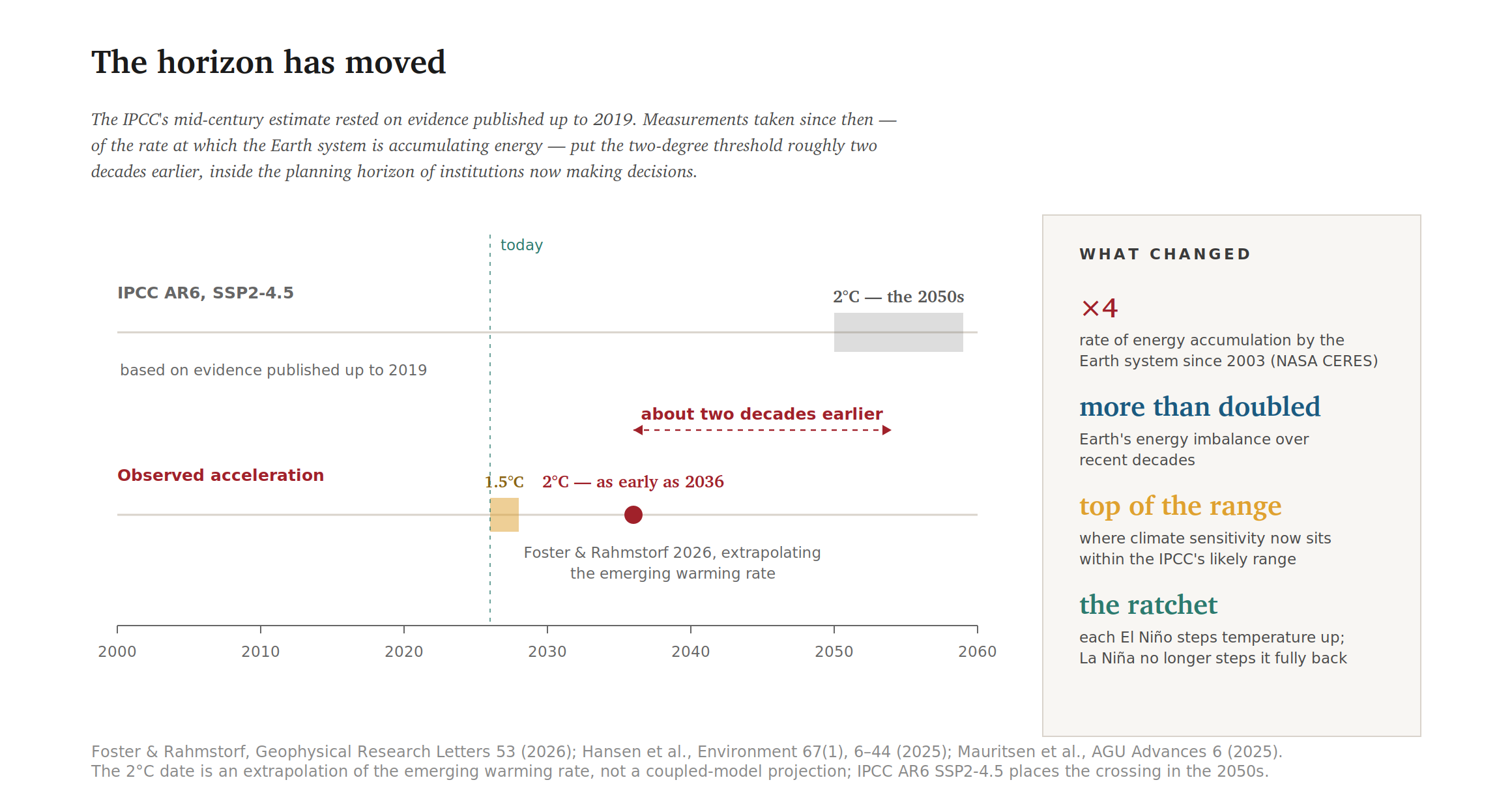
Figure 2. Two estimates of when 2ºC arrives, and what changed between them.
The consequence is that everything downstream of the changes in climate arrive faster. But plant breeding programs take years to move a trait from the trial plot to the farmer’s field. Irrigation schemes, grain reserves and cold chains take even longer to finance and construct. Trade agreements take longer still. On the timeline the physical evidence now supports for increasing global temperatures, 2°C arrives with very little warning and very little room for us to prepare.
The Calories That Quietly Disappear
The most useful single number in the agricultural literature comes from Hultgren and colleagues (2025), an eight-year study of six staple crops across 12,658 regions, capturing two-thirds of global crop calories. For every degree of global warming, the world loses approximately 120 kilocalories per person per day, about 4.4% of daily consumption. Critically, that estimate is net of adaptation: it already assumes farmers change cultivars, shift planting dates and adjust management in response to the climate they experience, despite the fact that farmers notoriously resist changes to their farming practices.8 In the West this temperature change and reduction in crop production mostly arrives as higher grocery prices. In the Global South it arrives as food insecurity and acute hunger.
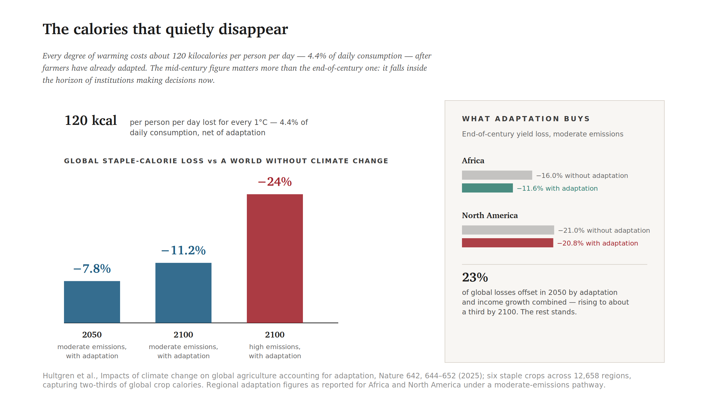
Figure 3. Global staple-calorie losses, and how much of them adaptation actually recovers.
The timeline matters as much as the magnitude. The same study, written before the energy-imbalance work by James Hansen and colleagues described above, puts the global calorie loss at roughly 7.4% by 2050 and 11.2% by 2100 under moderate emissions once adaptation is included, and 24% by 2100 on a high-emissions pathway. The 24% figure is the one the media picks up; the mid-century figure is the one that should be of immediate concern, especially as its timing is on the optimistic side. It sits inside the planning horizon of every finance ministry, development bank and grain trader now operating, and is far harder to dismiss as a future scenario.
Adaptation’s contribution can be stated precisely: adaptation and income growth together offset 23% of global losses in 2050, rising to about a third by 2100. That is real mitigation. But it is also a ceiling, and even with the adaptation fully implemented, it leaves the majority of the loss standing in a model already generous about how quickly temperatures will rise and farmers will adjust. The offset is also wildly uneven. In Africa it reduces projected end-of-century losses from 16.0 to 11.6%; in North America, from 21.0 to 20.8%, which is within rounding of nothing at all. The regions with the most agronomic capital have the least room left to improve, because they already farm close to the optimum.
The distributional result inside the same study is worth stating, because it cuts against the intuition that climate damage is a poor-country problem. Projected end-of-century crop yield losses average 41% in the wealthiest regions and 28% in the lowest-income regions. The steepest damage falls at both extremes of the agricultural economy: on modern breadbaskets currently enjoying the world’s best growing conditions, and on subsistence communities depending on small harvests of cassava and millet.
Behind the smooth averages sits a distinctly un-smooth implementation mechanism. Tropical staples such as maize, sorghum and rice are already grown close to their ceiling temperatures. Yield does not decline gently as the thermometer rises; it holds, and then collapses, because the damage is concentrated in a narrow reproductive window. Agronomists have measured the critical thresholds for seed set at flowering with unsettling precision: roughly 37.2°C for rice, 37.9°C for maize and just 27.3°C for wheat.9 Above that threshold during the flowering period leads to sterilized pollen and failed fertilization. Grain filling is also reduced, so even a handful of hot days can destroy a whole crop. In this context, averages hide the real hunger smallholders in the Global South and smaller farmers in the Global North will experience.
The nutrients that go missing too
There is a second loss inside the first, and it does not appear in tonnage of food harvested. Elevated atmospheric CO₂ makes staple plants grow more and nourish less. Wheat grown under the concentrations of CO2 expected in the atmosphere later this century loses approximately 9.3% of its zinc, 6.3% of its protein and 5.1% of its iron. Up to 35% of the global population depend on these crops for the bulk of those nutrients.
Translated into people rather than percentages, the effect is huge. Smith and Myers (2018) estimate that elevated CO₂ could push an additional 175 million people into zinc deficiency and 122 million into protein deficiency, while 1.4 billion women of childbearing age and young children, precisely the groups for whom iron status matters most would lose more than 4% of their dietary iron, by 2050. The burden of these nutrient losses concentrates in some particular countries rather than being spread in India alone, the same analysis finds roughly 50 million people newly zinc-deficient, 38 million newly protein-deficient, and 502 million women and children in the iron-vulnerable group.
Figure 4. Nutrient dilution under elevated CO₂, and the populations it reaches.
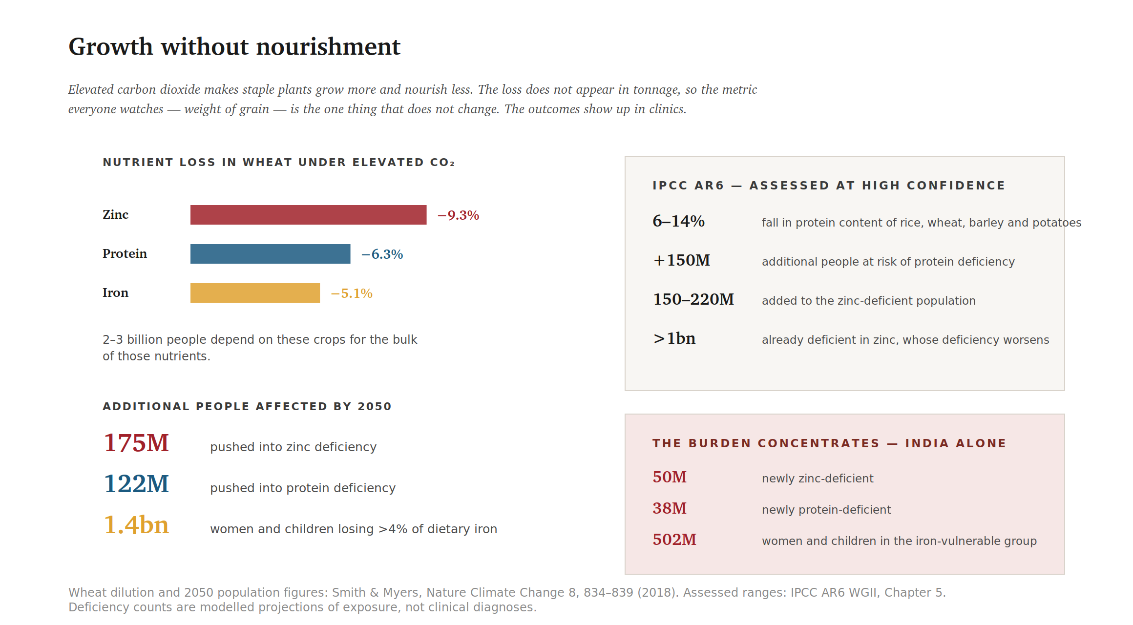
The IPCC’s Sixth Assessment reaches compatible conclusions and assigns them high confidence: protein content in rice, wheat, barley and potatoes falls by 6–14%, placing an additional 150 million people at risk of protein deficiency; zinc dilution adds 150–220 million to the zinc-deficient population and worsens deficiency in more than a billion people who are already deficient.10
A harvest can arrive exactly on target and still carry less nourishment than the same harvest did twenty years ago. The one number everybody watches is the weight of grain harvested, but weight of grain does not say how nutritious it is.
The outcomes show up in clinics, rather than on commodity exchanges, as stunted growth, impaired immune function, complications in pregnancy, higher child mortality. Hidden hunger is a term of art, but the hiding is literal. The metric everyone watches is the weight of grain, and the weight of grain is the one thing that does not change, how nutritious the grain is, on the other hand, does.
A One-Percent Grain Shortfall Becomes a Six-Percent Price Shock
Between a lost calorie and a hungry person sits a market, and markets for staple foods are peculiar. Demand is highly inelastic: people do not respond to a bad harvest by eating less bread. Supply is equally unresponsive within a season, because when one crop fails another cannot be planted for immediate replacement. The entire adjustment therefore falls on price.
The elasticities estimated by Roberts and Schlenker give the standard result.11 Their framework identifies demand using current-period yield shocks and supply using past shocks working through inventories and finds commodity demand to be extremely inelastic. A shortfall of roughly 1% in global caloric availability (a shortfall of corn, rice, wheat, sorghum or cassava) therefore produces a price movement several times larger, on the order of 6%; 2% crop reduction becomes roughly 12% price increase, 5% shortfall of grains becomes a 30% increase in price, and a 10% crop reduction becomes a 60% price increase8 (Some UK farmers are reporting a 20% drop in wheat yield this year due to the unprecedented 2026 drought and heat). Realized responses depend on stocks-to-use ratios, trade policy, export restrictions and speculative positioning, all of which can push the multiplier higher. This is not a market failure. It is what a well-functioning market does when neither supply nor demand can adjust. The impacts are real though.
Until recently this was a modelled claim. It is now an observed one. Kotz and colleagues (2025) document 16 cases across 18 countries between 2022 and 2024 in which extreme heat, drought or rainfall drove measurable food-price spikes, many following weather beyond all historical precedent prior to 2020.12 Olive oil across the European Union rose by around 50%. Japanese rice rose by around 48%. U.S. vegetable producer prices rose about 80% after drought across California and Arizona. Cocoa rose roughly 280% after a February 2024 West African heatwave that attribution analysis found had been made approximately 4°C hotter by climate change.
Figure 5. Documented price responses to recent climate extremes, and the mechanism that produces them. EU olive oil rose around 50%, and US vegetable producer prices around 80% after drought in California and Arizona.
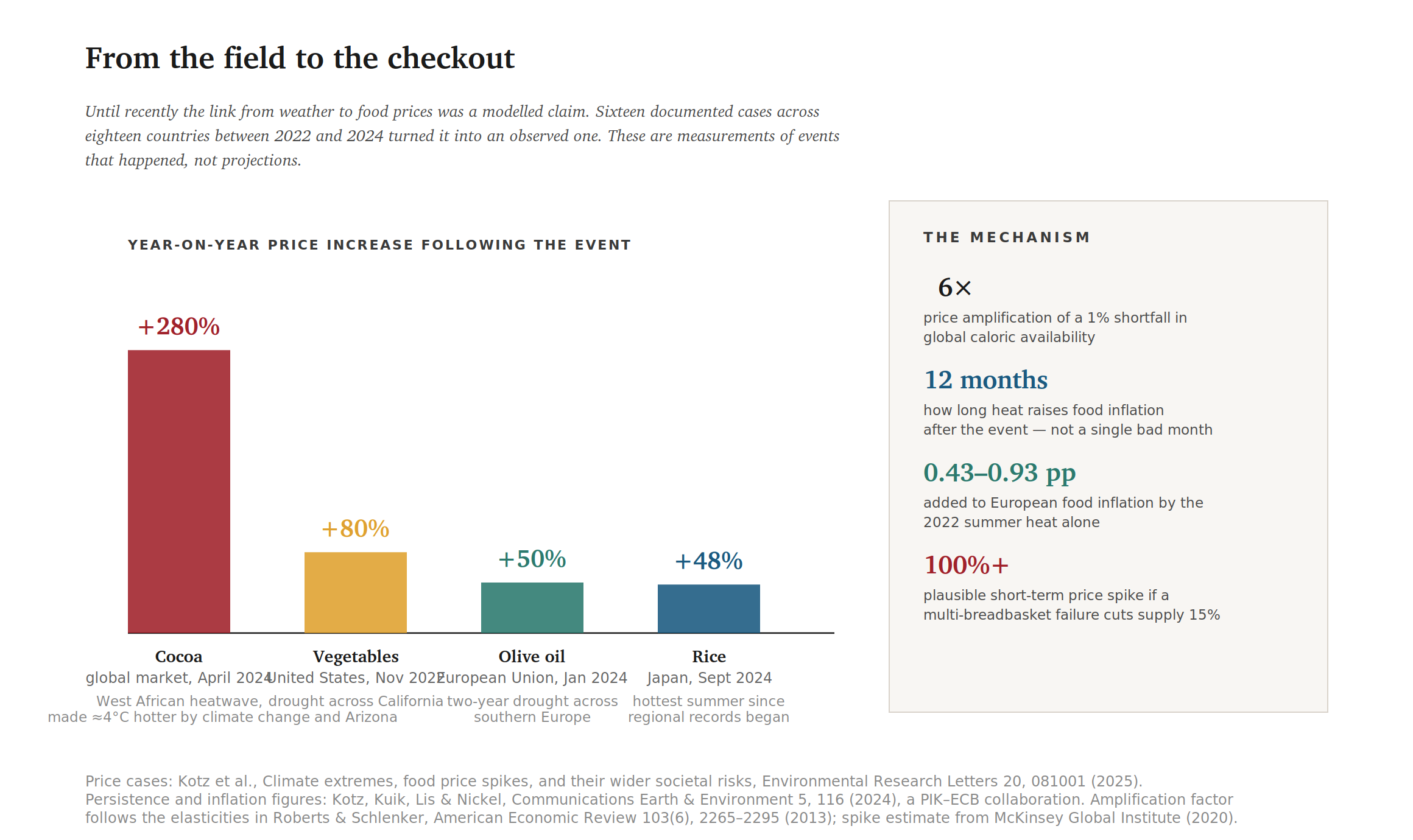
The persistence of the increase matters as much as the spike. Earlier work by Kotz and co-authors, a collaboration between the Potsdam Institute and the European Central Bank, found that higher temperatures and related crop shocks raise food and headline inflation persistently for roughly 12 months after the event.13 A single hot season is not a single bad month at the checkout. It is a year of elevated prices working through processing, retail and wage bargaining and landing on those least able to pay.
Then comes the political amplifier. Faced with domestic price pressure, exporting governments often restrict exports. Each restriction is locally rational and globally destructive: it removes supply from the world market at precisely the moment the world market is short, prompting the next exporter to do the same. The food price crises of 2007–08 and 2010–11 both followed this pattern, and both did more damage through policy cascade than through the underlying weather events.
For a household in a wealthy country spending a tenth of its income on food, a 6% rise in staple crop prices is an irritation. For a household spending half or more of its income on food, which describes a large share of the population in the regions covered below, it is the difference between three meals and two, or two meals and one a day.
When the Breadbaskets Fail Together
World grain trade rests on a small number of exporting regions: the US Midwest, the Southern Cone of South America, the Black Sea and eastern China, with Australia and India significant in wheat and rice. Five regional breadbaskets account for roughly 60% of global grain production. The system’s implicit insurance policy has always been that these regions do not fail in the same year: their weather has historically been close to uncorrelated, so a drought in one is covered by a surplus in another.
The system’s insurance policy has always been that the breadbaskets do not fail in the same year. Climate change is quietly cancelling this policy.
Work by Gaupp and colleagues shows that warming erodes exactly this assumption.14 Amplified Rossby wave patterns and hemispheric heat extremes couple the growing seasons of distant regions, converting independent risks into correlated ones.15 The probability of simultaneous failure does not rise gently with temperature; it ratchets up. The return period for simultaneous climate risk across all five maize breadbaskets falls from roughly every 16 years historically to under every 2 years in a world at 2°C.
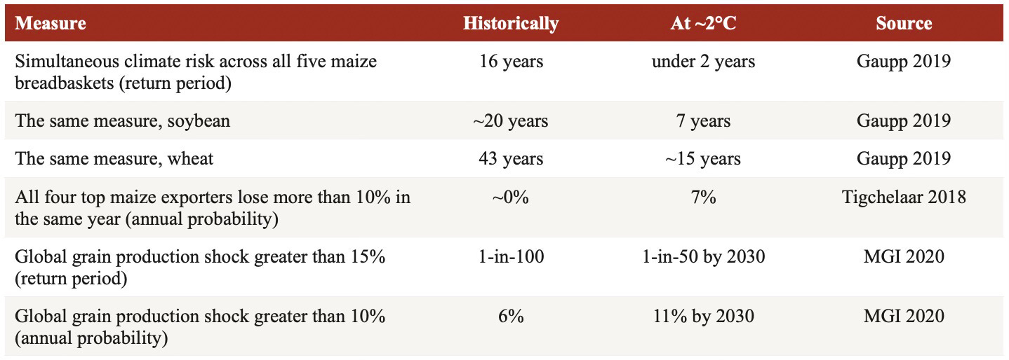
Table 1. The ratchet: how correlated failure risk changes with warming Rows are expressed in comparable units so they can be read against one another. Gaupp’s return periods are for all five breadbaskets simultaneously exceeding their climate thresholds; the 1.5°C intermediate values are 21 years for wheat, 9 for soybean and under 3 for maize, which is why this is a ratchet rather than a slope. Tigchelaar’s figure rises to 86% at 4°C. McKinsey’s figures refer to the decade centered on 2030 under a high-emissions scenario.
Tigchelaar and colleagues put the same risk in the units a trader watches. The top four maize exporters are the United States, Brazil, Argentina and Ukraine, and between them they account for 87% of global maize exports. The probability that all four suffer simultaneous production losses greater than 10% in a given year is presently close to zero; at 2°C it rises to 7%, and at 4°C to 86%. At 2°C the projected decline across those four amounts to some 53 million tonnes, equivalent to 43% of current global maize export volume.16
The McKinsey Global Institute’s 2020 analysis puts the same risk in the units a planner uses. The probability of a greater than 15% global grain production shock roughly doubles by 2030, from about 1-in-100 to about 1-in-50 in any given year, giving an 18% chance of occurrence between now and 2035. A smaller but still severe shock of a 10% loss moves from a 6% to an 11% annual probability, and from a 46 to a 69% chance of occurring at least once in the next decade.17 That is the decade in which 2°C plausibly arrives.
A 2024 study by Zhang and colleagues puts numbers on the physical mechanism. At approximately 2°C, the likelihood that the world’s breadbaskets concurrently expose more than half their cropland to at least five days of extreme heat during the reproductive window in a typical year, not an exceptional one, rises from virtually zero in the 1984–2013 baseline to 43% for maize, 33% for rice and soybean, and 27% for wheat.18
The Limits of What Adaptation Can Do to Protect Crops
The World Bank’s Turn Down the Heat assessment contains a threshold that is easy to skim past: below roughly 2°C, adaptation offsets a substantial share of agricultural losses; above it, it becomes rapidly harder and covers only a shrinking fraction of the damage caused by the increasing temperature. 2°C is where the returns bend downward. The same report finds that under 2°C, South Asian crop production may fall by at least 12%, requiring more than twice the imports to meet per-capita demand, with childhood stunting rising by around 35% by 2050.19 The IPCC projects soft adaptation limits for multiple staple crops in many growing areas at 2°C, particularly in the tropics.
The Hultgren figure quantifies this from the other direction: adaptation and income growth together offset 23% of global losses at mid-century. Call that the best available estimate of what a farming system doing its rational best can recover. Note what ‘adaptation’ means inside these models. It means switching cultivar, shifting a planting date, drilling a well, installing drip irrigation. Every one of these changes requires capital, credit, information, secure land tenure and, frequently, a water right. Smallholders who lack the reserves do not adapt the way the model predicts. At 2°C their adaptation increasingly means land abandonment and migration, which the models score as adaptation and the households experience as catastrophic loss.
A result that points the other way
Honesty requires including one finding that cuts the other way. Zhao and colleagues (2025) analyzed 92,096 hybrid-trial observations across the US Corn Belt between 2000 and 2020 and found that modern breeding delivered both yield gains and improved drought resistance; the trade-off breeders had long assumed would bind progress did not. Projected forward, continued genetic improvement of this kind could cut drought-related yield losses by approximately 17.8% by 2100 relative to older hybrids.20
The caveats are substantial and belong in the same breath. This is one crop, in one region, against one stressor. It addresses drought during grain filling, not extreme heat during pollination, which is the mechanism that does most of the damage to crops. It assumes the historical rate of developing genetic gains continues, and that farmers can afford the improved hybrids, fertilizers and other inputs that go with the new hybrids each season. It does not overturn Hultgren, whose estimates are already net of adaptation, and it does nothing for maize, sorghum or millet farmers in the Sahel or rest of the Global South.
A Map of Who Pays First
The additional hunger caused by a 2°C world does not distribute itself evenly, and the concentrations of damage and hunger are severe. South Asia carries roughly 33 million additional people at risk of hunger. Sub-Saharan Africa carries roughly 15 million additional hungry, plus approximately 43 million pushed below the poverty line. Across Sub-Saharan Africa, South Asia and Southeast Asia together sits around 80% of total exposure to additional hunger.
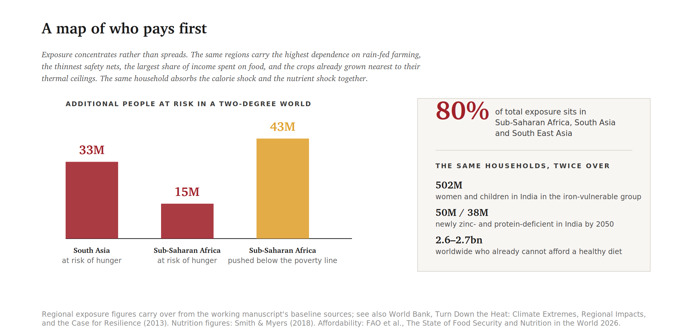
Figure 6. Where the additional exposure lands, and the populations already carrying a nutritional deficit.
The reasons compound rather than merely accumulate. These regions have the highest dependence on rain-fed agriculture and the thinnest irrigation coverage. They spend the largest share of household income on food, so the price channel of crop loss to price increase described above hits them hardest. Their staples are already grown nearest to their thermal ceilings, so a given increment of warming does more damage. Their safety nets are thinnest and their fiscal space to expand them smallest. Their populations are also the youngest, which means the nutritional deficits fall during the developmental window in which they may do permanent harm.
An independent analysis by Oxfam approaches the same map from the opposite end. Rather than ranking by modelled exposure, it ranks by revealed damage: the ten countries with the most extreme-weather-linked UN humanitarian appeals since 2000, where climate was assessed as a major contributor. They are Somalia, Haiti, Djibouti, Kenya, Niger, Afghanistan, Guatemala, Madagascar, Burkina Faso and Zimbabwe. Across those ten, acute hunger rose from 21.3 million people in 2016 to 47.5 million in 2021, a 123% increase in six years, with 18 million at emergency levels of hunger or worse.21
The same analysis supplies the arithmetic of responsibility that the modelling literature tends to leave out. Those ten countries account for roughly 0.13% of cumulative global carbon emissions. The G20 accounts for around 77%. The distribution of the damage is close to the inverse of the distribution of the cause, and no adaptation figure anywhere in this article alters that ratio. So far, the G20 are not fully meeting funding pledges to pay for adaptation in low-income countries hit hardest by climate change.
That is where the nutrition findings and the geography findings meet. The populations most exposed to calorie loss are, to a close approximation, the same populations carrying the nutrient losses described earlier. The same households absorb both shocks.
A third layer then sits on top: heat attacks food after harvest as well as before it. Higher temperatures accelerate spoilage and raise the risk of mycotoxin contamination, above all aflatoxin, a carcinogenic mold toxin in maize and groundnuts that worsens under exactly the combination of heat and drought stress a 2°C world delivers. Food-borne pathogen risks rise wherever cold chains are absent. Calories can be grown, harvested and delivered, and still not be safely eaten. Utilization is the pillar of food security that receives the least attention and is among the most temperature sensitive.
The Broad Base: Food Insecurity Now and at 2ºC
Next to chronic and acute hunger sits the third measure, and it is the broadest. The FAO’s Food Insecurity Experience Scale asks people directly whether, in the past year, they have had to eat less, skip meals, or go without food entirely for lack of money. By that measure roughly 2.3 billion people, about 28% of humanity, were moderately or severely food insecure in 2024, several hundred million of them severely food insecure, meaning they had at times run out of food or gone whole days without eating. The figure has barely moved since 2020 and sits roughly 680 million higher than in 2015. In sub-Saharan Africa it exceeds 58%, more than one person in two do not know where their next meal is coming from.22
Food insecurity measures access, not calories or crisis, and that is what makes it the base of the other two measures of hunger: chronic hunger and acute hunger. It captures the enormous population living one shock away from starvation: not necessarily undernourished on the calorie accounting, not yet inside the IPC’s crisis phases, but unable to count on enough safe and nutritious food from one day to the next. Roughly 2.6 billion people already cannot afford a healthy diet at all, before any further warming arrives.
2°C carries no published headcount for this measure, for the same reason it carries none for acute hunger: food insecurity is observed in surveys, not projected by crop models. But its transmission belt has already been traced. Access is governed by price, and a 1% shortfall becomes a price rise several times larger, with a single hot season lifting food inflation for a year afterwards. A durable rise in staple prices does not simply tighten budgets; it moves people down the scale, and from severe insecurity into the acute pipeline the next section describes. A world that lets food insecurity spread is quietly filling the reservoir from which the next decade’s famines will be drawn.
The Sharp End: Will Acute Hunger Get Worse?
Everything modelled so far is chronic hunger: the slow arithmetic of calories per person per day, nutrient density, prices and purchasing power. That is what the crop literature is built to produce, and it is the measure behind the one million to 183 million range. It is not the measure that produces famines. Acute crisis tracks shocks rather than averages: what happens when a harvest fails, a currency collapses, a road closes or a war starts, and a household with no reserves has nothing between it and hunger or even famine.
Figure 7. The acute hunger picture in 2025: how severe, and what drove it.
How much of this is already climate related?
The honest answer is: a large and rapidly growing share of acute hunger is caused by climate change, but not the largest share. In 2025 conflict and insecurity were the primary driver for 147.4 million people across 19 countries, that is 56% of the total. Weather extremes were the primary driver for 87.5 million people across 16 countries in 2025, about a third of the total acutely hungry people in the world.23
The trend inside that second number is the one to watch, especially in the context of 2°C of warming. As a primary driver of acute food insecurity, weather extremes accounted for 15.7 million people in 2020 and 87.5 million in 2025, a fivefold rise over a period in which global mean temperature moved by a fraction of a degree. Much of it traces to the 2023–24 El Niño, which devastated southern Africa, but this only temporarily rose temperatures to 1.6°C. A near-certain super El Niño for 2026–27 is already in the FAO and WFP hotspot outlook, which warns of deterioration across 13 countries and territories, with northeast Nigeria and Somalia joining Sudan, South Sudan, Yemen and Palestine at the highest level of concern.24
For the causal link itself, the closest thing to a controlled experiment is the Horn of Africa. Between late 2020 and 2022, five consecutive rainy seasons failed across southern Ethiopia, Somalia and eastern Kenya, the worst drought in four decades. Attribution analysis found the agricultural drought was made roughly 100 times more likely by human-caused global warming, and that an event of that severity would not have occurred in a climate 1.2°C cooler.25 More than 20 million people were pushed into Crisis or worse, and in Somalia an estimated 43,000 excess deaths occurred in 2022 alone, about half of them children under five.26
A child stunted in a famine year is stunted permanently. There is no later harvest that gives those years of nutrition back. Stunting causes a lifetime of physical, metabolic, and cognitive challenges.
What 2°C does to the shock machinery
No published study puts a number on how many people will be in acute hunger or famine in a 2°C world. The IPC classifies observed conditions rather than projecting them, and the humanitarian and conflict variables that dominate it are not forecastable on a multi-decade horizon. Anyone offering a precise figure is extrapolating past the evidence. What can be done instead is to ask, driver by driver, whether the machinery that generates acute crises runs more often at 2°C. On every input for which projections exist, it does, meaning it is much more likely that acute hunger will increase in a 2°C world.
· Drought exposure rises. The IPCC’s assessment finds an additional 350 million urban residents exposed to water scarcity from severe drought at 1.5°C, rising to 410.7 million at 2°C; across all populations the additional exposure roughly doubles between the two thresholds. Drying is amplified in the tropics, which is where the protracted crises already are.27
· Extreme heat exposure rises far faster. Around 700 million people, approximately 9% of the world, would face extreme heatwaves at least once every twenty years at 1.5°C. At 2°C the figure is more than 2 billion, or 28% of the world.28 Heat does not only cut yields; it destroys the casual agricultural labor that landless households in crisis contexts depend on for the income to buy food.
· Shocks become more correlated and more frequent. The breadbasket evidence above is the machinery of acute crisis stated in physical units. A correlated shock is worse for acute hunger than for chronic hunger, because the mechanism that normally rescues a failed region, imports from one that did not fail, is exactly what a correlated shock removes.
· The price channel is an acute-hunger channel. The twelve-month persistence of heat-driven food price inflation matters far more to a household in Phase 2 hunger than to one in a wealthy country. Phase 2 acute hunger is where the people who fall into Phase 3 severe acute hunger come from, and a year of elevated prices is how they get there.
· Recovery capacity is not being rebuilt. The same 33 countries have appeared in every edition of the crisis report since 2016, and more than 80% of the severely food-insecure now live in protracted crisis contexts. These are places where a bad harvest is no longer a setback but a cumulative loss, because the resilience that used to absorb it has gone. Each new shock lands on the residue of the last.
The estimate, and its uncertainty
Setting those pieces together supports a directional judgement rather than a point estimate, and it should be labelled as such: this is inference from the drivers, not a projection anyone has published.
Acute food insecurity will almost certainly be worse at 2°C than it is now, and the mechanism will be frequency in addition to the then level of the acute hunger crises. The expectation is not that the world settles at a permanently higher number, but that the peaks come closer together. A bad year arrives before the previous one has been absorbed. Set the El Niño impacts beside a fivefold rise in weather-driven acute hunger over five years and a fraction of a degree, and a doubling of the weather-attributable component by mid-century reads as conservative. Whether the total number of people suffering from acute hunger doubles depends overwhelmingly on conflict, which nobody can forecast and which can be expected to worsen where there is less food. Conflict, climate and the cost of food are the three factors driving rates of hunger around the world.
The number that deserves the closest watch is not the headline count but the Catastrophe population. It has risen ninefold since 2016 to 1.4 million people in 2025, and famine was confirmed in two places in the same year in 2025 for the first time. Catastrophe is where a shock meets the absence of a response, which makes it the most sensitive indicator of both trends at once: hazards increasing, humanitarian capacity contracting. The 2026 crisis report expects no improvement, reporting the fall in humanitarian food-sector funding at around 39% against 2024, with development assistance down at least 15%. In the past, peoples of the world rallied to provide food to people in famines, (remember Live Aid?), and the fact that this did not happen to any great extent in 2025 does not bode well for the hungry people when 2°C arrives.
All of this points at the conclusion the chronic analysis reached, arriving from the other direction. The increase in acute hunger in a 2°C world is real, already growing, and already measurable in mortality rates - people are dying. But the difference between a bad decade and a catastrophic one still runs through whether anyone is funded to respond, whether trade stays open when the shock lands, and whether countries in permanent crisis are given any means of rebuilding the buffer that used to absorb the next crisis. WFP puts the return on taking anticipatory action at three to seven dollars saved for every dollar spent. 2°C decides how often the shock arrives. It does not decide how many people it kills.
What It Means in America, Britain and Australia
Crops do not fail gradually. The relationship between temperature and yield established by Schlenker and Roberts is sharply asymmetric and piecewise: below a crop-specific threshold, around 29°C for maize, 30°C for soybean, 32°C for cotton, additional warmth is mildly beneficial; above it, damage accumulates several times faster.29 Warming does not drive a smooth curve. It moves more of the growing season onto the wrong side of a hard biological edge.
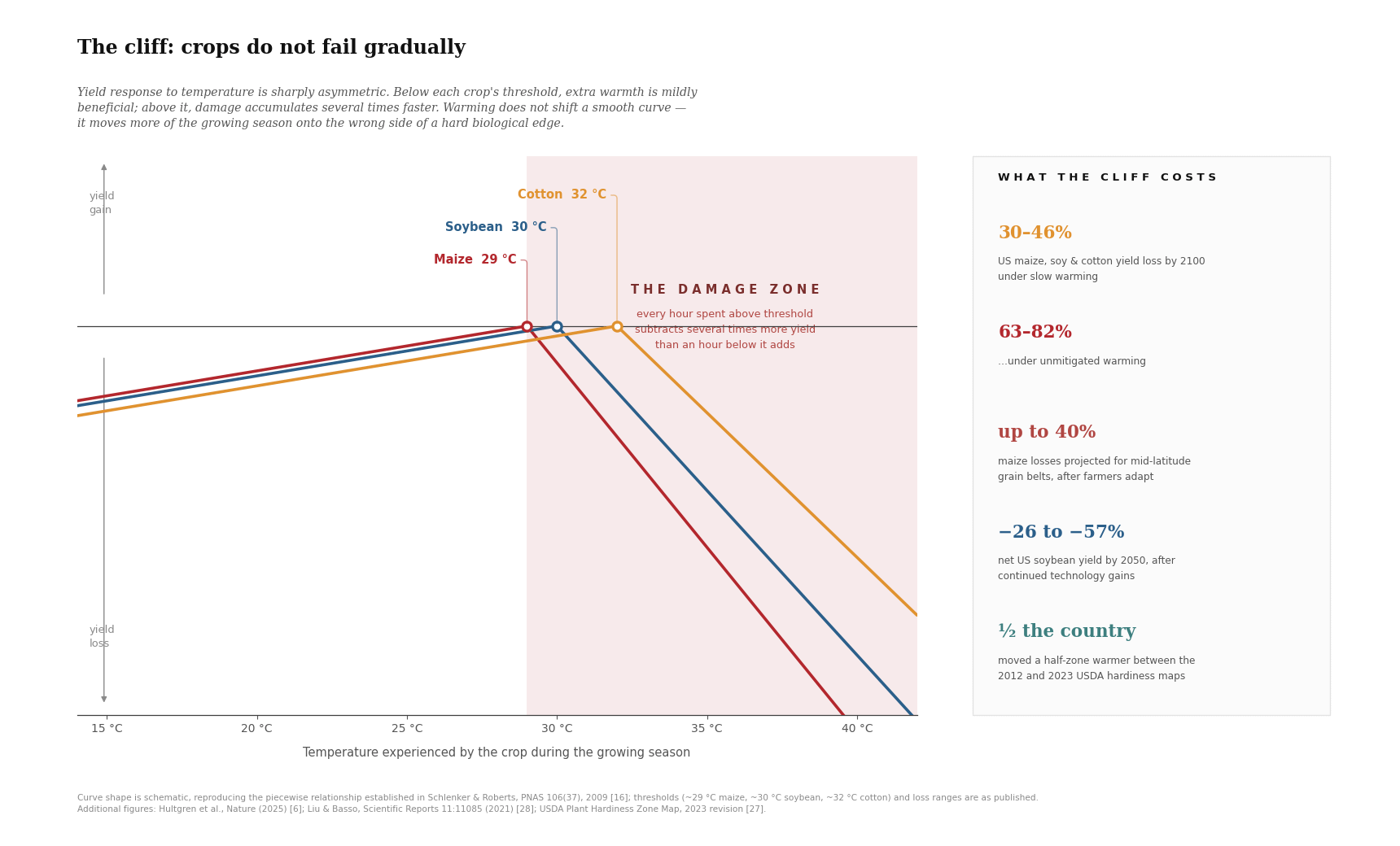
Figure 8. The temperature threshold above which US crop losses accelerate, and what crossing it costs.
The modelled consequences for the United States are stark: reductions of 30 to 46% in maize, soy and cotton yields by 2100 under slower warming, and 63 to 82% under unmitigated warming. Hultgren’s global analysis projects maize losses of up to 40% for mid-latitude grain belts even after farmers adapt, and separate work by Liu and Basso projects net US soybean yields will be 26 to 57% lower by 2050.30 The climate is already moving underneath the system: roughly half the country shifted a half-zone warmer between the 2012 and 2023 revisions of the USDA Plant Hardiness Zone Map.31
American hunger from climate change nevertheless arrives through a different door than in Malawi or Bangladesh. The United States is a net exporter with deep reserves and a highly capitalized farm sector; supermarket shelves will not go empty. What changes are the prices on the shelf and, upstream, crop insurance costs, farm incomes, land values and the fiscal exposure of federal support programs. Low-water events on the Mississippi already interrupt grain movement in drought years. There is also a trade dimension the Hultgren authors state bluntly: as northern latitudes gain and mid-latitudes lose, agricultural advantage is going to transfer to Canada, Russia and China.
The households that feel these price rises are the ones already spending a high share of their income on food, and they feel it in the same year that public budgets are absorbing disaster and insurance costs. It is the price elasticity described earlier, operating inside a wealthy country: a modest availability shock, a multiplied price response, and the impact concentrated on the poor and working classes.
Britain’s exposure is structurally different, because Britain is a net importer of food. It is the case where the correlated-failure mechanism described earlier lands directly on a wealthy population. Two of the three worst UK wheat harvests on record have occurred this decade, in 2020 and 2024, both caused by relentless rainfall and wheat self-sufficiency fell from 96% in 2023 to 79% in 2024, with imports the following autumn running at double the five-year average. Across 2020 to 2024 the cumulative shortfall exceeded seven million tonnes. Then 2025 failed from the opposite direction, in one of the hottest and driest springs and summers on record. 2026 looks like being even worse. A country short of wheat in a wet year and short again in successive dry ones is not having bad luck. It is experiencing climate variance; both can be bad and expected to get worse as 2°C is reached.32
The second half of that exposure is that Britain’s suppliers sit in the regions this article has already identified as losing when the temperature rises to 2°C. More than 90% of imported vegetables come from the Mediterranean, with Spain being the largest single supplier. Spain has been in a historic drought. Headline self-sufficiency across all farming sectors has fallen from 86 to 78%. Domestic shortfall and supplier shortfall are not independent events; they are two expressions of the same warming, which is the correlation problem operating at the scale of one country’s shopping basket.33 Europe is also the fastest warming continent meaning the effects of warming arrive here first.
Australia sits between the two and supplies the longest-running natural experiment. Its wheat yields stopped rising in 1990. Hochman and colleagues simulated 50 representative sites across the grain zone and found that water-limited yield potential fell 27% between 1990 and 2015, driven by declining rainfall and rising maximum temperatures, with elevated CO₂ preventing a further 4% loss. National yields nonetheless held flat, because technology closed the gap between what farmers achieved and what the climate permitted, lifting relative yields from 39 to 55% of potential.34
There is a qualification here that cuts both ways. The Zhao breeding result is a Corn Belt study, and if any agricultural region on earth has the pipeline, the capital and the agronomic data to bend its own curve, it is this one, and that is the strongest reason to think the American numbers may land nearer the optimistic end of their range. The Australian record is what taking a bet on agriculture looks like after twenty-five years: it paid, and it paid by spending the yield gap it was closing, which is why Hochman’s authors end by asking whether the gains can continue. Neither case is a reason to expect the same in the Sahel or the rest of the Global South.
The Window That Is Still Open
If most of the distance between one million and 183 million is policy, then the policies that should be implemented need exploring. Four fronts carry most of the leverage.
First, keep the grain moving
This is the largest single lever in the literature and the cheapest to implement. The difference between a world in which staple crop trade stays open during a crop price shock and one in which exporters close their borders is a swing of approximately 53 million people at risk of hunger. It requires no new technology, no infrastructure and no transfer of funds. It requires only that governments refrain from doing the thing they are most tempted to do at the worst possible moment. The temptation is strongest when the stakes are highest and price shocks and grain availability are at their worst. The mechanism by which countries agree not to close their borders has to be built in advance: pre-commitments against export bans, exemptions for humanitarian purchases, and regional reserves. Such an agreement takes negotiation and time. The process to agree to open borders must start now, before the crisis really starts to gain momentum.
Second, breed for nutrition and break the monoculture
Biofortification now has a hard target rather than a general aspiration, and the nutrient figures above state exactly what it is up against. Zinc-biofortified wheat and rice, high-iron beans and pearl millet, and quality-protein maize are existing technologies with existing delivery channels. What they lack is scale.
Alongside biofortification sits diversification away from over-reliance on four dominant monocultures. Millets, sorghum, cassava and legumes carry higher thermal tolerance and, in several cases, better micronutrient density than the crops they were displaced by. Rebuilding seed systems, agronomic knowledge and consumer demand for them is slow work, which is an argument for starting now rather than for postponing, given we may have only a decade to work with.
Third, fund the response before the failure, not after it
The compressed timeline established at the start of this article is the whole argument here. If 2ºC plausibly arrives in the mid-2030s rather than the 2050s, then adaptation finance disbursed in the 2040s is finance disbursed after the event. Irrigation, on-farm and regional storage, decentralized solar-powered cold chains, processing hubs close to production, extension services and seed systems all take the better part of a decade to plan, fund and build. Front-loading is not a preference about spending profiles. It is arithmetic about lead times.
Fourth, build safety nets that trigger on a forecast, not on a famine
The FAO’s 2026 affordability data provided this warning: approximately 2.6–2.7 billion people, 31.3 to 32.5% of the world, already cannot afford a healthy diet before any 2ºC shock arrives.35 A 6% staple price move applied to a household already priced out of adequate nutrition does not produce belt-tightening. It produces substitution into cheaper, less nutritious calories, which compounds the dilution effect described earlier.
The design feature that matters is automaticity. Safety nets that expand by discretionary political decision expand late, after the harm is done and after the politics have hardened. Safety nets indexed to observable triggers, such as food price indices, rainfall deficits, satellite-observed vegetation stress which release resources when certain thresholds are crossed. The technology for this exists and such systems are in operation in several countries. Expansion of these systems is a question of coverage and financing and getting countries to allow these inventions. Linking safety net response to climate signals such as Earth’s Energy Imbalance may even provide an outlook away from natural variability in weather.
Every famine that follows a forecast drought is a policy choice made a year earlier, by people who had the forecast and failed to act.
The direction of travel
Everything above is written as though these four fronts were open. But we do not live in an ideal rational world. Three of them are currently closing, not through climate stress but by political choice.
2025 brought the largest single-year contraction in development assistance ever recorded. Aid from OECD donors fell 23.1% in real terms to $174.3 billion dollars, back to roughly where it stood in 2015 when the 2030 Agenda was adopted. The United States drove three-quarters of the fall, cutting its own aid by 56.9%, the largest reduction by any provider in any year on record, with Germany, France, the United Kingdom and Japan all cutting foreign aid as well. Humanitarian assistance fell 35.8%, and core contributions to the UN system fell 27%. A further 5.8% fall is projected for 2026.36
The incidence is not evenly spread, and the geography should look familiar. The OECD projects bilateral aid to the least developed countries falling by 13 to 25%, and to sub-Saharan Africa by 16 to 28%. That is the same map as the 80% of climate exposure described earlier, and as the 60% of the 2030 chronic-hunger projection that sits in Africa.
The operational consequences are already measurable. In Uganda, donor shortfalls forced the suspension of food assistance for a million refugees and ration cuts of up to 80%, alongside a rise in global acute malnutrition among refugees from 5.5% at the end of 2024 to 7.7% in late 2025.37 Peer-reviewed modelling of the US cuts alone projects more than 14 million additional deaths by 2030 across 133 countries, including 4.5 million children under five.38 None of those cuts were forced by anything other than a political choice.
None of this makes the four fronts wrong. It makes three of them counterfactual. Front-loaded adaptation finance and automatically triggered safety nets are the levers that set the multiplier between one million and 183 million, and both are being dismantled in precisely the years before 2ºC arrives, which raises the standing of the one lever that costs nothing. Keeping staple trade open is the only front that does not require money that is no longer there, and on the accelerated timeline it may be the only one that can still be built in time.
Conclusions - The 2ºC Warning
Food is not merely an economic commodity. It is the baseline condition on which every other form of order rests. Governments survive inflation in most things; they survive it in bread less often. The historical record of price spikes in staple grains is also a record of unrest, of conflict, of migration, of state capacity failing under a load it was not designed to carry. When the harvest fails in several places at once, the consequences do not stay agricultural for long.
The instinct in wealthy countries is to treat this as somebody else’s emergency, buffered by distance and purchasing power. That instinct misreads the system twice over. A globally integrated food network transmits scarcity through price, and price reaches everywhere the network reaches. And the modelling does not even grant wealthy agriculture the protection it assumes: the steepest projected losses fall on today’s best growing regions, because they have the least headroom left. Wealth buys position in the queue. It does not buy exemption from the queue.
Which returns the argument to where it began. One million to 183 million. The physics that sets the shock is now largely determined; the acceleration in the energy imbalance has taken the choice about whether 2°C arrives, and much of the choice about when, out of our hands. What remains entirely in our hands is the multiplier: whether borders stay open, whether safety nets hold during food price shocks, whether the money arrives before the harvest fails rather than after.
The 2°C dinner table is being set. What ends up on it, and who is seated at the table, is still, for now, ours to decide. It will not be for much longer.
Action you can take
The choices remaining are narrowing as 2°C approaches faster than anyone anticipated and are therefore far more consequential. They are being made now, in budget lines and trade rules and appropriations votes, by people who will not do anything about it unless somebody demands that they do. So, ask them.
The aid contraction described above was not a natural disaster; it was a set of votes and decisions made by elected officials. Votes can be taken again to reverse those decisions. The trade commitments that keep grain moving in a crisis are negotiated in advance or not at all. The safety nets that decide whether a price spike becomes hunger are written into domestic law by legislators who answer to constituents.
· Call your representatives, at all levels, and ask what they intend to do about food security before the shock arrives rather than after it.
· Ask what they are doing to restore humanitarian and development funding. Ask whether they will commit, publicly and now, against export bans in the next crisis.
· In the US, demand that USAID and SNAP funding be restored and other actions are taken in anticipation of the super El Niño we are about to experience. We have 150 years of data; we know where crises are going to occur. We should be stocking food and other humanitarian supplies before these crises happen.
Thanks for reading Climate Uncovered! Subscribe for free to receive new posts and support my work.
If you found this article interesting or useful, please tick the ❤️ button as it helps the algorithm point more people in this direction and gives us feedback on what subjects are most useful. Thank you!
Please also visit and subscribe to Mark’s 4Hunger.org Substack!
A note on the evidence used
The figures in this article come from three classes of evidence, and they do not deserve equal weight. Observed and attributed is the strongest: the price cases documented by Kotz and colleagues, the USDA hardiness-zone revision, the UK harvest record and the rise in the Earth’s energy imbalance are all measurements of events that happened. Assessed with stated confidence covers the IPCC’s nutrient-dilution findings, which carry an explicit high confidence label. Modelled projections, which include Hultgren, Smith and Myers, Gaupp, Tigchelaar, Zhang, Zhao, Hochman and the McKinsey analysis, are conditional on assumptions about emissions, adaptation speed, trade and income growth, and the conditions are the argument.
This is why the headline range is so wide. Studies at the low end assume open trade, effective adaptation and continued income growth; studies at the high end assume the opposite. Neither is wrong. They answer different questions, and reporting the range honestly is more useful than selecting a point estimate that flatters a position. Three things would move the numbers toward the optimistic end: sustained genetic gains of the kind Zhao documents, a durable regime holding staple trade open through a synchronized shock, and biofortification reaching scale faster than dilution accumulates. Three would move it the other way: a synchronized breadbasket failure arriving before adaptation finance does, a cascade of export restrictions, and the contraction in assistance persisting through the 2030s.
END NOTES:
1. Foster, G., & Rahmstorf, S. (2026). Global warming has accelerated significantly. Geophysical Research Letters, 53, e2025GL118804. https://doi.org/10.1029/2025GL118804. The 2036 date is an extrapolation of the emerging warming rate, not a coupled-model projection.
2. Rosegrant, M. W., Sulser, T. B., Dunston, S., et al. (2024). Food and nutrition security under changing climate and socioeconomic conditions. Global Food Security. IFPRI IMPACT model. ‘At risk of hunger’ is IMPACT’s analogue of the prevalence of undernourishment and is not identically defined, so comparison with FAO’s figure is indicative rather than exact.
3. The one-million-to-183-million range. Low end: a 2026 multi-model assessment puts the direct climate effect at 9.6 million additional people at risk by 2050 under business as usual, with lower estimates in the same family. Mid-range: IFPRI (2022), Global Food Policy Report, Ch. 14, roughly 70 million by 2050. High end: IPCC AR6 WGII, which assesses food prices up to a third higher by 2050, placing an additional 183 million people in low-income households at risk of chronic hunger. The width is a statement about model structure, chiefly the weight given to price transmission, trade and adaptation, rather than about the physics.
4. FAO, IFAD, UNICEF, WFP and WHO. The State of Food Security and Nutrition in the World. Rome: FAO, 2025 and 2026 editions. Source for the 645 million figure for 2025, the 2030 projection, and the cost-and-affordability series. The 18-country data gap is noted in the same editions.

My comment only scratched the surface there are many more example of people fighting back, it's the only sane option.
Now add to this the price shock this fall when spring’s fertilizer shortage appears in the harvest results at the same time that they stop forcing a constraint on fuel prices and there is diesel shortage for harvest and shipping. As well, the war in the Black Sea is damaging grain shipments to Africa, their main supply of grain. Remember how the Old Testament admonished nations for not keeping multiple years of grain reserve to cover years of poor yields, yet the world runs on how many days ahead of food supply? It is way past time to figure the carrying capacity of this planet and work toward that, even while that capacity itself is shrinking due to our constant mortgaging of our future. Nature bats last.